Global Navigation
USAA • Lead Designer • 2021–2024
- Delivered information architecture plans to reorganize usaa.com and apps.
- Designed global navigation solution to align with launch of Reveille Design System.
- Solved for both public- and private-facing navigation modes.
- Built in-depth prototypes at multiple breakpoints.
- Conducted quantitative and qualitative research, looking for opportunities to optimize user engagement.
- Managed business and development processes.
- Established critical groundwork for launch of USAA’s Reveille Design System.
- On-time delivery for activation of AEM content management system.
- Successfully built a coalition of business stakeholders.
- Unified disparate navigation systems across multiple web technology platforms.
- Storefront utilization via global navigation increased by 19%.
As a member of USAA’s design system team, I was given an assignment to redesign the global navigation menus for usaa.com. This was needed to prepare the site for USAA’s updated brand and second-generation design system.
The existing navigation system hadn’t seen a major update in at least seven years. The design needed to be responsive for all screen sizes, deployable across a mix of web frameworks, and accessible for all users.
The new design would affect millions of users, with more than 60 million interactions every month.
The project also had the potential to impact business performance, with more than 50% of digital sales originating from usaa.com.
And there would be many stakeholders—including leaders from insurance, banking, retirement, investing, advice, and enterprise areas. Each would bring their own definition of what success would look like.
Shipping a new navigation system would be a journey.
Understanding the Problem Space
Good design always starts from a place of clear understanding.
My prior experience at USAA had given me the opportunity to learn broadly about the mix of financial services they offer. But USAA was undergoing changes in its business model as it exited its operations in investing and retirement. I needed to reorient around USAA’s revised go-to-market strategy.
The trouble was, USAA’s new strategy hadn’t been clarified or defined.
I asked for guidance from brand, marketing, legal, compliance, and the executive council. They provided answers that helped me gain a better sense of USAA’s new value proposition. These insights would prove essential, as they equipped me to provide the “why” behind future design decisions for global navigation.
Beyond business strategy, I would need to understand how users think, search, and navigate when trying to find the products and services offered by USAA. This would include both prospects and existing members. More than anything, this would be an information architecture (IA) challenge.
Fortunately, in the area of IA, I had a head start. In the months prior, I had conducted qualitative research in pursuit of a target-state, omnichannel IA plan. Results from thousands of participants helped point the way to a more effective approach for labeling and organizing USAA’s products and services.
Beyond users, I also needed to understand the technology environment. We formed a working group to begin reviewing the situation and devising technical approaches. As we surveyed the technology environment, we identified two domains and six unique delivery platforms.
My understanding of the problem space had grown:
- Business: USAA was undergoing changes. It would be important to align the web experience with the new mix of products and services that would define USAA’s value to prospective members.
- Users: My qualitative research had helped us zero in on a better way to organize navigation. I had also observed that users wanted a service-focused navigation experience after logging on. And we would emphasize consistency across web and mobile app platforms.
- Technology: We settled on an approach that would allow us to build a unified, responsive navigation interface—and deliver it seamlessly to a variety of unique delivery platforms.
Exploring the Art of the Possible
Before deciding on a solution, it’s worth spending some time exploring.
I was fortunate to inherit some early design explorations from another team in our design organization. They were winding down their involvement, but they had generated some early concepts and had conducted stakeholder workshops. I met with the team to learn about their findings.
Their proposed approach wasn’t what I initially had in mind, but their work broadened my perspective and gave me early insight into the kinds of solutions that were likely to work best.
During this transition, the originating team raised concerns about the target-state IA that I was planning to leverage. They weren’t sure it reflected the way users would want to navigate. They shared alternative IA models that relied on organizing concepts I hadn’t previously considered or tested.
I wanted everyone to have confidence in our direction, so I launched a follow-on series of IA tree studies, comparing the baseline IA against my new model, and also introducing the newly proposed models. The results were clear—the originally proposed new approach would work best for most tasks and most products and services. We had our direction and it was grounded in data and consensus.
I also conducted a competitive audit, reviewing other websites from USAA competitors and beyond. I compiled results into a Mural board. My goal was to harness Jakob’s Law—trying to ensure that our menu system would feel familiar and easy for everyone to use.
From there, I launched into initial execution of Sketch-based design assets for the navigation system. This came at a time when the second generation of USAA’s design system was still taking shape. This presented me with an interesting challenge: I needed to design something new—while also anticipating and aligning to a whole new system of typography, color, grid, space, and interactive affordances.
To help ensure alignment with the rest of the design system team, I shared my work at my team’s design critiques, and also opened up for comments and feedback through Slack and InVision. Going further, I socialized with other design teams and stakeholders to solicit feedback.
This mix of exploring and iterating had begun to pay off.
Refining Designs and Choosing a Path
As the design took near-final shape, I built out additional breakpoints so I could demonstrate minimum and maximum sizes, while also addressing some important in-between sizes. The design encompassed both the public-facing website, as well as the member-facing authenticated site.
I created a comprehensive prototype experience using Sketch and InVision with dozens of linked screens. The prototype included both desktop and mobile designs. This made it easy to socialize the new, responsive design with everyone at USAA, allowing anyone to browse around and see where everything would be placed in the new design.
To keep the prototype easy to maintain, I leveraged Sketch symbols. Changes were as easy as updating the Sketch design file, and then bulk-uploading artboards to InVision using a plugin. I would then follow up in InVision, checking links to make sure everything still worked as expected.
To further refine the design, I put the prototypes through our design organization’s pre-production review process. This was an opportunity to get feedback from design, content, and accessibility experts. The accessibility team identified some areas where I could improve, and I worked with them to find solutions that would balance the needs of all users.
The design was progressing, but we still wanted to know—would it work?
Validation through User Testing
The updated design was already being socialized internally. But I still needed to validate these designs with users.
I created a qualitative test plan with an initial focus on first-click performance. This gave me an opportunity to gauge the top-level usability of the new designs. And because first-click studies can be scaled up to large numbers of participants, I would be able to get a directional sense of performance differences when comparing baseline results against the redesign. I also configured the test to compare results across desktop and mobile sizes. To ensure a balanced mix of insights and to help prevent recency bias, I wrote user tasks that covered a wide variety of situations and needs.
I configured the tests in UserZoomhttps://www.userzoom.com and submitted the plans for review and approval by our design organization’s research ops team.
With hundreds of participants having completed the tests, the results were clear. The new designs pointed to improved performance: 35% better success in 18% less time, when compared with baseline.
After that, I created an unmoderated usability test plan. This would give us an opportunity to learn about a wider range of interactive behaviors (but without the benefit of quantified/directional comparison).
The usability tests were a success—no major interaction design problems encountered. Users were able to complete their tasks, usually quickly and without much trouble. I observed each session’s recording to capture notes and listen to the way participants were thinking and verbalizing as they navigated.
Additionally, USAA hired a consulting firm, Accenture, to conduct a website audit and advise on improvements. As a part of their research, Accenture asked to meet and review my target-state IA and navigation designs. I provided in-depth documentation and explained our research results. Accenture came back with a formal recommendation: USAA should implement the proposed changes, without delay.
But there was more work to do.
Seeking Stakeholder Alignment
We needed to ensure broad awareness for the upcoming changes. I partnered with the product owner to map out a communication plan. I designed a deck that explained the changes, supporting research, and proposed benefits.
We worked together to facilitate dozens of share-out meetings—providing an overview, fielding questions, and sharing access to the interactive prototype.
Recognizing the unusually large scale and impact of this project, I made a point to keep a detailed wiki-based log of our meetings and outcomes.
Once we had reached all of the necessary stakeholders and confirmed alignment, we were ready to deliver.
Collaborating with Engineering
USAA web infrastructure was splintered across two domains, four major application platforms, and two content management systems. To deliver anything, our infrastructure and engineering partners would be making major changes to all of their underlying page templates.
We knew we wanted to serve up a unified, consistent global navigation system. So we needed an approach that would be compatible across this wide array of client environments. But how? Server-centric Java, client-centric React, and proprietary CMS systems don’t like to work together.
We eventually settled on a path forward—less than perfect, but still progress. The infrastructure team would build global navigation as a standalone, responsive React application. And that application, in turn, would be retrieved via client-side code and loaded into an HTML shim that would be preconfigured in each of the various platforms’ core templates.
I helped the team align around the approach. Things almost fell apart when the search engine optimization (SEO) team shared that the proposed solution wouldn’t work. I kept lines of communication open, and we found a way to test and verify that search engines would still be able to parse the contents of the dynamically loaded navigation menus.
With a technical approach in place, I went to work building out detailed design specifications for the engineering team. I created designs across a range of breakpoints. I gave guidance on accessibility-related behaviors. And I designed, exported, and optimized various SVG icons and assets.
Collaboration and refinement was made easier through InVision prototypes and comment threads, as well as through wiki pages.
Accessibility-related considerations included visual contrast, information hierarchy, keyboard-based navigation, focus management, modal containment, search and autocomplete behaviors, alt text, and ARIA labels. We decided to avoid on-hover behaviors with the drop-down menus, choosing instead to rely on the predictability and control of click- and keyboard-based menu activation.
The engineering team abstracted the menu contents into a JSON object, anticipating the eventual deployment of an externalized API that would be accessed across web and mobile apps.
I stayed in close contact with the engineering team. I would routinely receive updated demo links or screenshots with questions. I would follow up with notes and clarifications. With our combined efforts, the solution became increasingly refined and polished.
Around this time, the product owner shared that he was moving to a different team at USAA. This left us without business ownership. To keep things moving forward, I worked to represent the product perspective in planning and decisions. Later on, I helped onboard, educate, and actively support three separate rounds of newly assigned product owners.
Time to Ship
To assist in the launch process, I wrote and designed change-management updates to be shared with all USAA employees and members. And I published a temporary webpage with details on the change.
Launch day finally arrived. The engineering team was rolling out simultaneous updates across all of the major platforms. We were shipping a significant change in look and feel for all users, literally overnight.
The launch was a success. Now to find out: Was this all worth it?
Reviewing Analytics and Feedback
As soon as they were available, I started compiling and visualizing performance trends.
The new navigation design delivered significant benefits. We saw a 30% year-over-year increase in storefront traffic, paired with a 24% year-over-year improvement in sales. This was especially notable because it reversed a pattern of negative trends that had persisted for at least five years.
The results validated the core premise of our approach: By making it easier for users to navigate and find what they were seeking, we could improve both the user experience, as well as USAA’s business performance.
And along the way, we had delivered a design solution that was responsive, accessible to all members, and was aligned with our second-generation design system.
Optimizing with A/B Testing
With the new navigation system in place, I got to work partnering with stakeholders across business areas to design and conduct A/B tests, looking for ways to further optimize performance.
Some of the studies yielded helpful improvements, while others helped us avoid changes that would have had a negative effect.
Other areas of optimization have included fine-tuning accessibility features (for example, making adjustments to better support Smart Invert on iOS and macOS).
Retrospective
I learned a lot through this process. I enjoyed a great deal of success in collaboration and teamwork. But also some lessons and observations for future efforts:
-
If possible, A/B test before the big launch. We were under a deadline and there were some technical blockers to A/B testing with this redesign. But in hindsight, a pre-release A/B test would have made for a smoother transition (and less stress for some of our stakeholders).
-
If possible, avoid overlapping releases. We shipped global navigation while an update to the member portal was being released to members (itself phased over the course of several months). I had designed global navigation and the new portal to work as a complementary system. The new navigation design wasn’t as helpful when paired with the old portal. So this created concerns while we watched member satisfaction scores take a hit. I dug into these trends in our analytics systems, and eventually put forward the hypothesis that the old portal design was contributing to the problem. The data science team crunched numbers and eventually confirmed this hypothesis. We saw scores fully recover over time (and particularly once the old portal interface was 100% retired).
-
Be careful not to lean too much on design conventions. USAA celebrated its 100th year in 2022. As a part of a range of celebratory marketing initiatives, we updated the USAA logo in global navigation by removing the word “Home” and temporarily placing a custom-designed “100” logo in that area. It looked great! I expected the logo would continue to act in its conventional role of the “home” button. Which proved to be the case—at least, for most users. But some users were confused and struggled to find their way back to the home page. We saw an 11% drop in member satisfaction while the 100th anniversary design was in production. We removed the special logo, and member satisfaction scores quickly recovered. Lesson learned: Jakob’s Law can help, but it isn’t an absolute.
-
It’s good to keep notes and a history of collaboration across teams. This was a long-running process. It was helpful to have a history available.
Addendum
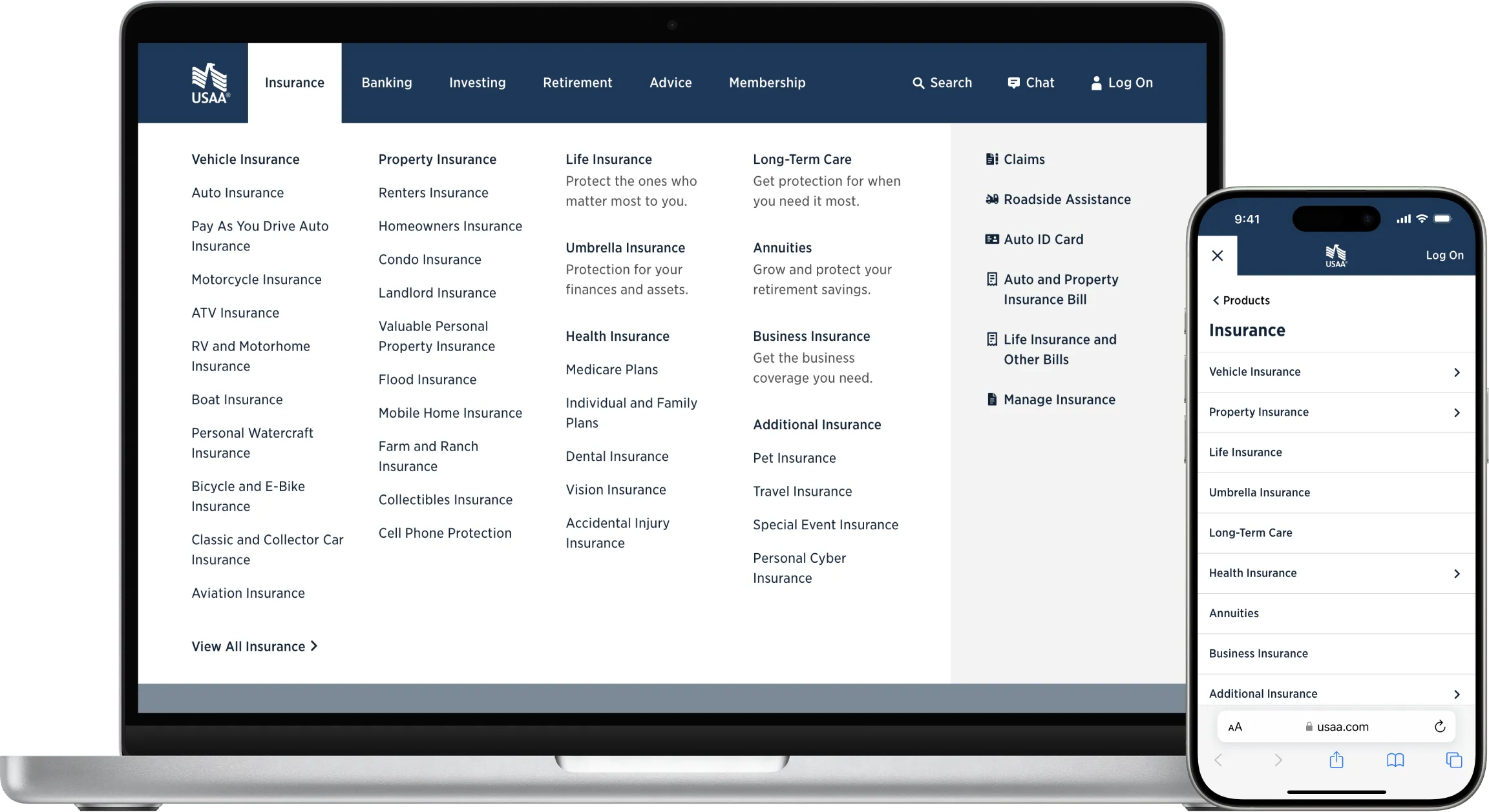
You can see the global navigation on usaa.com today.
The work continues. Because we built global navigation before our new design system had shipped, we relied on the first-generation design system and styled it to match the new system.
I am working with my product and engineering partners to ship a refreshed version of global navigation, utilizing the latest design system components, icons, and tokens. As a part of this effort, I have rebuilt all of the global navigation design assets in Figma, where I am utilizing features including components, auto layout, system-based styles and colors, variables (tokens), and Figma’s new developer mode for improved collaboration with the engineering team.