Platform Information Architecture
USAA • Lead Designer • 2017–2024
- Conducted qualitative research with thousands of participants.
- Designed an omnichannel approach to IA.
- Conducted alignment workshops with dozens of stakeholders.
- Built a React app to share YAML-managed IA model.
- Up to 50% greater user engagement with web navigation menus.
- Up to 24% greater product acquisition on the website.
- Up to 40% greater product acquisition in mobile apps.
- New tools and workflows to iterate and improve IA.
With major redesigns underway across USAA digital platforms, the time seemed right to overhaul the information architecture (IA).
In the past, projects like this had typically been handled by third-party consulting firms. They would be brought in for a few months, and it wasn’t always guaranteed that their output would have a lasting impact.
I was running this effort on my own and I didn’t want to take a fly-by-night approach.
I would need to find a way through uncharted territory—solving problems that would encompass design, qualitative research, stakeholder collaboration, quantitative analysis, custom software development, and the launch of new workflows.
Finding the Architecture in Information
How do users think? That’s the question at the heart of any IA problem. If you can match your IA to the way users think, your product can feel almost effortless to use.
USAA’s digital channels were inconsistent. They had been built in operational silos, with differing IA solutions across web and mobile apps.
I decided on an omnichannel approach, building from a hypothesis that users’ mental models would remain basically consistent, regardless of their channel of choice.
If my approach worked, the benefits would be significant:
- Unified learning and improvement across digital platforms. I had watched siloed teams work independently to optimize their product area. This stretched resources thin, and sometimes resulted in missed opportunities, thereby reducing the total impact of each team’s efforts.
- Comfortable and familiar experience for USAA members across web and mobile apps. I had listened to members as they voiced a strong preference for one channel over another. These preferences had grown from a place of unfamiliarity and discomfort with learning something “new,” just because they had logged into the website or mobile app for the first time.
- Cost reductions through centralized APIs. At the time, IT was building siloed infrastructure to match the siloed digital channels. This didn’t align with what I was seeing across the industry, where centralized APIs served both web and mobile app experiences.
- Integrated sales-service life cycle. I had observed that product acquisition flows were also plagued with fragmentation. Users could start acquiring a product in one channel—but never see an opportunity to resume in a different channel.
In addition to pursuing an omnichannel approach, I wanted to dig deep and find a better way to organize products and services. I imagined this might be a way to boost digital product acquisition by a few percentage points.
Research to Find a Direction
Making sense of a large information space can be a challenge. My first steps included:
- Creating an inventory of current-state IA, providing a snapshot of the baseline experience.
- Review of digital analytics, looking for trends and patterns in existing navigation behaviors.
- Brand strategy review, ensuring that the core navigation model would align with USAA’s go-to-market strategy.
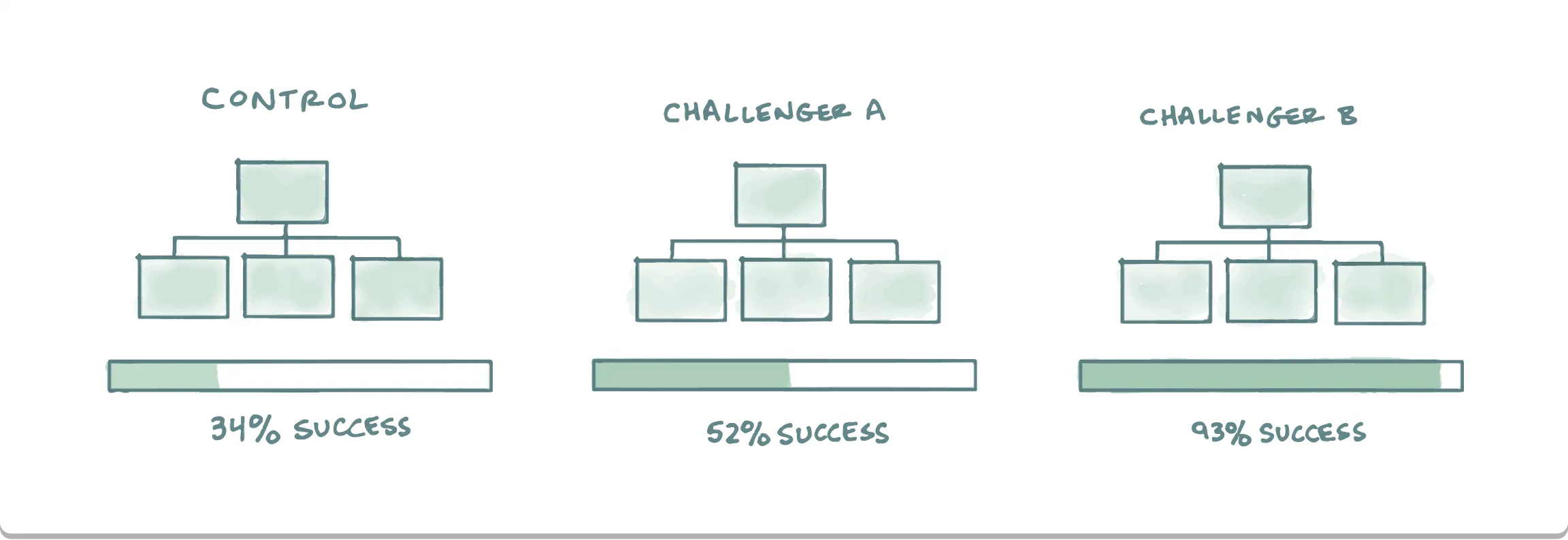
I launched a series of qualitative research efforts using Optimal Workshop, UserTesting, and UserZoom.
My approach included generative card sorts, evaluative tree tests, and evaluative first-click tests.
With the evaluative studies, I utilized:
- Randomized task order, plus a diverse mix of task types, to help prevent recency bias in the test results.
- Recruitments of 50–100 participants per test, to help ensure adequate statistical validity in the results.
- Inclusion of baseline IA models, allowing me to compare results and gauge directional impact.
The research involved many iterations and thousands of participants.
The results from the card sort helped me identify big-picture patterns in the way users wanted to think about USAA’s products and services. I dug into the resulting data and extrapolated findings based on the kinds of words being used. I also found helpful patterns in the types of cards that were frequently grouped together.
The results from the tree tests allowed me to evaluate the effectiveness of entire systems of navigation. It quickly became clear that there were opportunities for improvement over baseline. Our existing IA didn’t consistently match up with the way users wanted to think and navigate.
Through all of these steps, I found opportunities to simplify and improve the IA for both the public website and private portal. And because we were testing against the baseline IA, I could conclude with greater confidence that users were finding what they needed faster, and with greater success.
The qualitative data helped me paint a clear picture of value in adopting change. But it wasn’t my decision to make. So what would need to happen next?
Stakeholder Workshops
To move forward with the proposed changes, it was important to make sure that I had consensus among stakeholders. This included areas including enterprise digital, the lines of business, search engine optimization (SEO), digital content and publishing, and more.
At the time, USAA was operating with only limited governance over digital decisions. This left me with a landscape of many different stakeholders, and no central mechanism by which to seek approval for change.
To achieve alignment, I decided to schedule a series of workshops where I would share sections of the IA, discuss research results, gather feedback, and document decisions. I also made a point to include low-fidelity sketches of how the IA might take shape across different channels. When new questions or concerns were raised, I would work to gather competitive analysis, or fresh qualitative research, to help resolve questions and settle on a direction. Whenever possible, I worked to help the team make decisions that were grounded in data and research, in a way that acknowledged and balanced the overarching go-to-market strategy.
Something else that helped: While running qualitative research, I had created a library of wiki pages with in-depth analysis of the research results. Perhaps more than any deck could achieve, this library helped open the door to qualitative research within the organization, and made my work transparent and accessible to anyone with questions.
Additionally, USAA hired a consulting firm, Accenture, to conduct a website audit and advise on improvements. As a part of their research, Accenture asked to meet and review the target-state IA. I provided in-depth documentation and explained the research results. Accenture came back with a formal recommendation: USAA should implement the proposed changes, without delay.
Delivering IA-Aligned Designs
The process that was undertaken to design and deliver these changes is more than I’ll cover in this case study. Brief highlights:
- I worked closely to support the design team that redesigned the member-service portal for web and mobile apps.
- I redesigned and helped deliver a next-generation global navigation system for the USAA website.
Measuring Impact
As these changes rolled out across the website and apps, we observed year-over-year gains:
- Up to 50% greater user engagement with web navigation menus.
- Up to 24% greater product acquisition on the website.
- Up to 40% greater product acquisition in mobile apps.
These quantitative results validated what we had learned during qualitative research. Furthermore, they underscored the value of IA But these improvements also raised an important question: How would we continue to build on this success?
To Sustain Gains, Sustain Management
I wanted to find ways to maintain and build on our momentum. But how?
I had grown tired of creating (and then discarding) visual artifacts for information architecture. I felt there must be a better way.
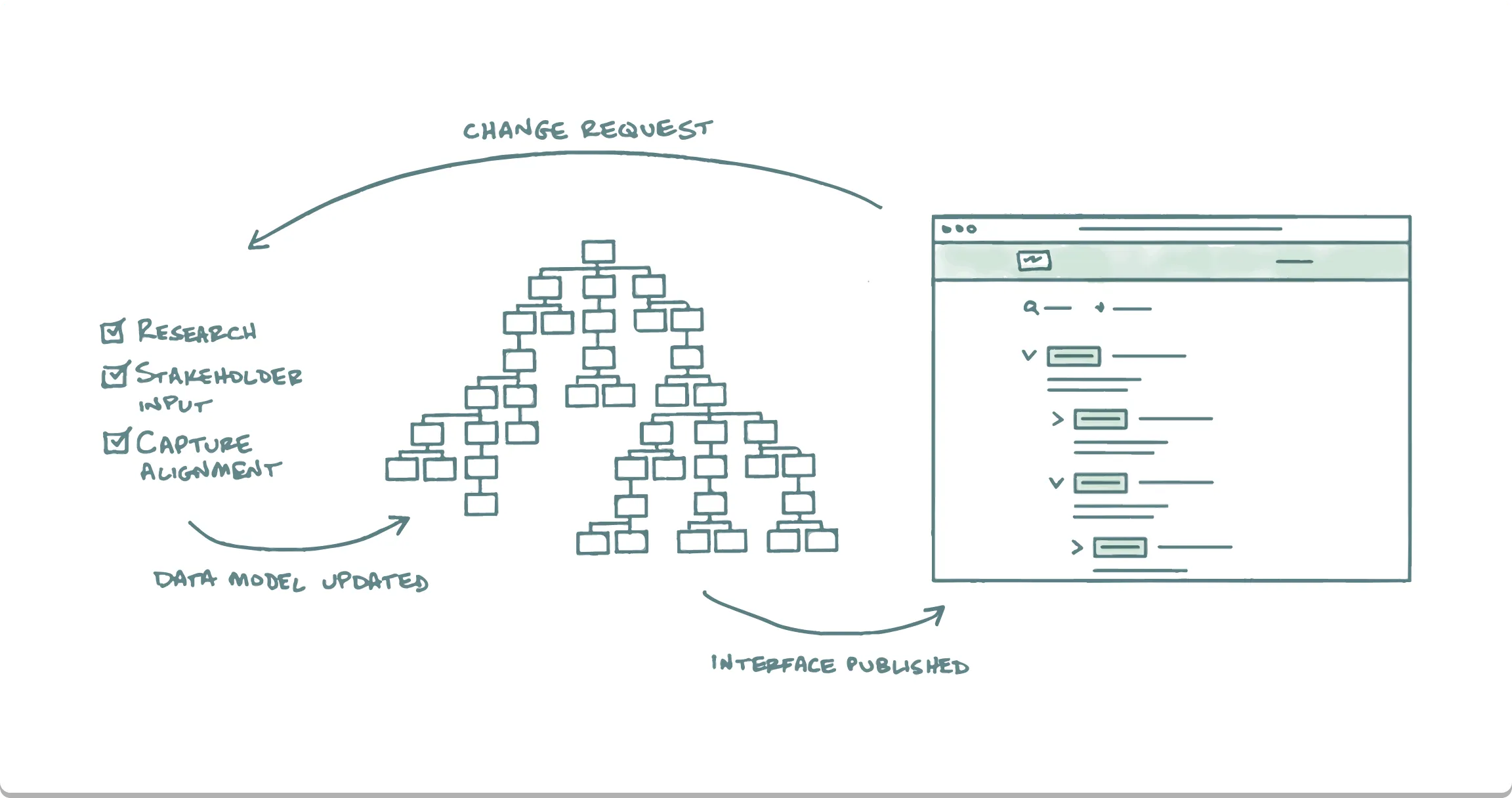
I decided to treat the IA as data, managed in a source-controlled repository, and presented to users with a helpful interface.
If the approach worked, I would be able to help ensure greater visibility and understanding of the IA. And I could build a repeatable process that would engage internal stakeholders and subject-matter experts (many of the same participants who had contributed to the early workshops focused on the target-state IA).
I would call this new tool the Tree Viewer.
Designing the Tree Viewer
I kept my design explorations light. I sketched out some basic ideas around the arrangement of IA data. I wanted to pursue a design that would emphasize a tree-style view (a bit like what we might find in an operating system’s file browser).
The feedback loop between design and programming can be helpful. So I moved quickly from my exploratory sketches and into coding.
This kind of early transition to code has risks and benefits:
- Risk: I didn’t have the benefit of user feedback, meaning I was accepting the possibility of rework after launching a beta.
- Benefit: I would be able to move quickly, “design with code,” deploy faster, and give users an immersive feel for where this was all going.
Data Model
Early in the process, I began writing out ideas for the underlying data model that would serve as source-of-truth for the IA. I settled on a few key concepts:
- I would rely on Jesse James Garrett’s excellent visual vocabulary for describing information architecture. His work included useful concepts like elements, conditional elements, areas, and continuation points.
- I would store the IA data in a text file. This would ensure the transparency, accountability, and collaboration that comes with a Git-based source controlled repository. And it would avoid the complexity and opaqueness of database- or cloud-storage solutions.
- I settled on YAML 1.2 as the format for data serialization. It was portable, easier to read and edit than JSON, and popular enough to offer a variety of npm packages that would make it easy to parse.
- Random, six-digit IDs would ensure portability of elements in the IA, and would serve as the backbone of permalinks—making it easy for team members to share hyperlinks to any element within the IA.
As I got started, the syntax for an IA element looked something like this:
ia:
  - id: 239598
    name: Jeremy Fisher — Product Designer in Colorado
    breadcrumb: Home
    definition: Home page with introductory information and a list of portfolio entries.
    url: https://www.fisherfrontier.com/
As I finalized the design for the data model, I wrote in-depth README documentation that would be made available in the GitLab repository. It covered every supported attribute and provided guidance for what could be stored.
The YAML file eventually grew to contain thousands of lines of code. Hierarchical relationships looked something like this:
ia:
  - id: 239598
    name: Jeremy Fisher — Product Designer in Colorado
    breadcrumb: Home
    definition: Home page with introductory information and a list of portfolio entries.
    url: https://www.fisherfrontier.com/
    children:
      - id: 957873
        name: Jeremy Fisher’s Blog
        breadcrumb: Blog
        definition: List of blog entries.
        url: https://www.fisherfrontier.com/blog/
        children:
          - id: 755430
            name: Hello Again, World
            breadcrumb: Hello Again, World
            definition: A note about changes in design and tech over the past 18 years.
            url: https://www.fisherfrontier.com/blog/2024-01-18-hello-again-world/
          - id: 811201
            name: A Computer Was Born
            breadcrumb: A Computer Was Born
            definition: Some thoughts on ENIAC, one of the world’s first computers.
            url: https://www.fisherfrontier.com/blog/2006-02-14-computer-was-born/
To boost efficiency, I wrote a Python script to automate the process of assigning random IDs to newly cataloged elements (and preventing duplicates). I authored a second Python script to streamline the process of importing hundreds of URLs from preexisting pages—extracting page HTML metadata and formatting the information into my YAML syntax.
I also wrote custom code snippets for Visual Studio Code and bundled them into the project, making it faster and easier to enter recurring IA code patterns.
I then wrote a JavaScript class-based object model that parsed the YAML source data and layered in a variety of convenience functions, including a search API, auto-constructed URLs, visibility into parent/child relationships, and auto-constructed breadcrumb values.
Once the data and object models were in a workable draft stage, I started work on the React user interface.
React Build
I decided to use USAA’s React-based design system for the user interface. To get started, I configured my local workstation for Node, created a new project in my GitLab team, and connected my local project to the GitLab repo.
Next, I used one of USAA’s developer command-line utilities to stub out a blank internal project. From there, I got to work importing the various Node packages that I would need, adding various JSX user interface elements.
The design system components were great to work with. Much of my learning curve centered around React and its approach to managing data and UI state. When I ran into problems, I’d reach out to one of the front-end developers on my team to get their advice.
Along the way, I noticed some issues with slow performance. It turned out, I had written the code in a way that automatically traversed the entire IA and populated the DOM with every single node in the tree. I made some adjustments to ensure that rendering was on-demand. Responsiveness in the browser went back to its snappy old self.
With some time and effort, things started coming together. I had a functional user interface with a growing number of features:
- Tree-style nested interface that users could click through to find IA elements.
- Element-level details available for viewing in a friendly format.
- Menus with tools including the ability to copy element details, permalinks, and more.
- Menus to get users started with requesting changes to the IA.
- Metadata included assigned reviewers and links to GitLab issues where rationale was documented and decisions had been made.
- Permalink URLs that would automatically open and scroll to the linked element.
- Download options including CSV, plain text, YAML, and JSON.
Integrated search was beyond my capacity for the 1.0 release. I tabled the feature for a future update.
Windows IIS Deployment
For the version 1.0 deployment, I decided to skip the process of configuring a GitLab CI/CD-based deployment. To keep things simple, I would instead use a USAA command-line utility to repackage the project’s npm production build, and then copy the build output to a Windows IIS server.
With the solution up and running, I started socializing and gathering feedback. The first version of the IA tool was well received. And as I received feedback, I iterated and updated the code to make improvements.
Now, with the IA tool up and running, I could make IA changes quickly and easily. I would simply update the YAML file, use Git to commit and push my changes to the source code repository, and then build and deploy the project.
GitLab Workflow
I wanted to create a repeatable workflow for managing the IA. The process would need to make it easy to bring together stakeholders from across different business and subject-matter areas.
For the version 1.0 solution, I designed a workflow that relied on GitLab issues. And to make it fast and easy to open new issues, I programmed my IA tool to submit prefilled Markdown directly into the GitLab issue, by way of URL-encoded query string parameters.
Alongside the asynchronous workflow enabled by GitLab issues, I also launched weekly office hours and a dedicated Slack channel, inviting teams to come together and collaborate on IA planning and changes.
In a shift from previous generations of IA management at USAA, I emphasized the direct involvement of business decision makers. I also included representatives from SEO and content. It was my sense that this mix of participants helped produce the best and most durable decisions, benefiting from a diverse range of perspectives.
Use of the tool spread. It wasn’t long before it had been taken up by the publishing and SEO teams as their canonical source for IA. And interest spread even further, with teams from search and conversational UI relying on exports of the IA to help improve their projects.
v2 Update
Some time later, during the launch of USAA’s second-generation design system, I wanted to update the Tree Viewer application.
Once I found the time, I got back into the code. What I found troubled me. There were some confusing sections where logic and presentation were deeply nested and intertwined. It wasn’t reflective of best practices for writing a declarative user interface.
Rather than start from scratch, I installed the new design system packages, and I went to work swapping out components, replacing old with new. In areas where the code was poorly structured, I took the opportunity to reorganize my work and break apart functions into smaller units that were easy to approach and understand. I also implemented a move from React’s original class-based approach to React Hooks.
Where the opportunity presented itself, I made use of the design system’s new tokens for things like space, color, and typography.
I started down the path of an Express-powered API endpoint for the IA data and functions. After reviewing with the developers on my team, we agreed that it was probably more than was necessary at the time. I tabled it for a future update.
Version 2.0 of the application was taking shape, and it would deliver a number of helpful new features:
- Update to second-generation design system components.
- Modernized, maintainable code with React Hooks and design system tokens.
- Robust search feature with keyword highlighting.
- Integrated links to Figma design teams and folders.
AWS Deployment
The Windows IIS server had been deprecated and was destined for retirement. This meant the time was right to go ahead and tackle the GitLab CI/CD pipeline and deployment to Amazon Web Services (AWS).
I collaborated with one of the developers on my team to implement the correct configuration settings. We tested the CI/CD pipeline a few times before we eventually had everything working as expected.
To help ease the transition, I implemented custom redirects of all IA permalinks, pointing from the Windows IIS server to the application’s new URL.
JWM Workflow
Managing our workflow in GitLab issues had worked well, but there were some headaches that came with it. USAA’s IT organization was aggressive about limiting the number of seats used in GitLab. And there were forms to fill out every time we needed to add a new business reviewer. Add to that the fact that most of our business users weren’t well-versed in GitLab or Markdown, and it was clear that we would eventually need a different tool for managing IA change requests.
The opportunity arrived when Jira Work Management (JWM) was made available.
I created a project for IA in JWM and configured the various forms, data fields, processes, and roles. I made updates to the Tree Viewer application so it would direct anyone requesting changes to a JWM front-door form, replacing the previous GitLab-based workflow. I wasn’t able to rely on GET-style query string parameters to transmit data to JWM, so instead, I built copy/paste-style functions into the IA interface, allowing users to quickly grab the information they needed to paste Markdown-formatted information right into JWM. Additionally, key transitions in the JWM workflow were configured to post automatic updates to the IA Slack channel.
The transition went smoothly and has helped improve visibility and participation in the IA workflow.
Retrospective
It has been a privilege to tackle these problems and deliver solutions that have helped shape and unify so many different projects across USAA. And it’s been inspiring to see the impact that design and information architecture can have on business performance.
A few parting thoughts:
- Don’t underestimate the value and importance of language. Words matter. Possibly more than any other part of a user interface.
- I really like building solutions with solutions that I’ve helped to build.
- Big changes need a lot of teamwork and collaboration. I’m grateful to each person who’s pitched in with their creative input.